A baseball training academy needed a brand as serious as the athletes it develops. No chrome effects. No tired sports clichés. Just a mark that belongs in the room with the best.
THE BRIEF
A training academy that plays at the highest level needs to look like it.
THE BRIEF
Powermill Training Academy isn’t a weekend hitting clinic. It’s a serious baseball development program built around elite instruction, measurable results, and athletes who want to play at the next level.
The brand had to match that ambition — without falling into the trap that catches most sports brands: trying so hard to look powerful that everything ends up looking the same.
THE CHALLENGE
Stand apart in a crowded category. Baseball training brands are a visual arms race of gradients, chrome, and aggressive type. Powermill needed to win by going the other direction.
Appeal to two audiences at once. Serious youth athletes who want to feel elite, and the parents who are actually writing the checks — and care about credibility and professionalism.
Work everywhere. The brand needed to live on apparel, a website, a brand guide, and promotional materials — all without losing its character at any size or application.
Establish instant authority. A new academy doesn’t have years of reputation to lean on. The brand had to do that work from day one.
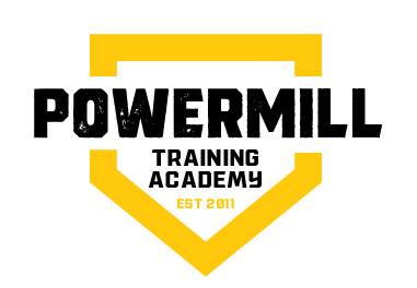
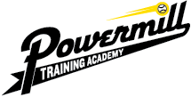
THE MARK
Built to Command a Dugout Wall.
The Powermill identity system leads with a primary mark that’s bold enough for a jersey and refined enough for a business card. Clean geometry. Unambiguous hierarchy. A mark that reads immediately at 12 pixels or 12 feet.
THE SYSTEM
A complete brand — not just a logo.
The logo is the entry point. A brand system is what makes it consistent six months from now when someone who wasn’t in the room is creating materials. We built Powermill the whole thing.
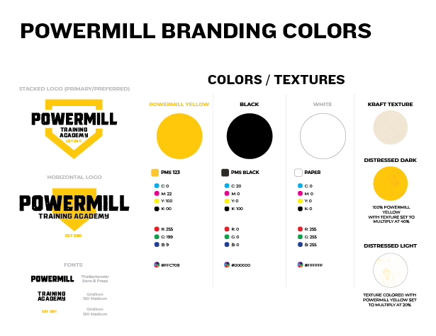
Color, type, spacing rules, usage guidelines, and application examples — built into a brand guide the team can actually use without calling us every time.
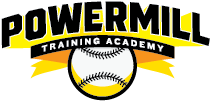
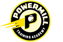
Primary + alternate logo marks
Color palette with usage rules
Typography system
Apparel + merchandise applications
APPLICATIONS
The Brand in the Wild
A mark earns its keep when it moves off the screen and onto the field. Powermill’s identity was built from the start to hold up on fabric, mesh, and structured materials — the places where athletes actually live in a brand.
Performance Shirt
The primary mark applied to training apparel — athletes wear the brand to every session and every showcase event.
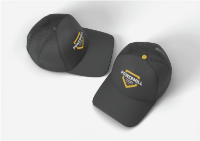
Trucker hats
Structured front panel, alternate mark. Promotional merchandise that doubles as brand presence in the bleachers.
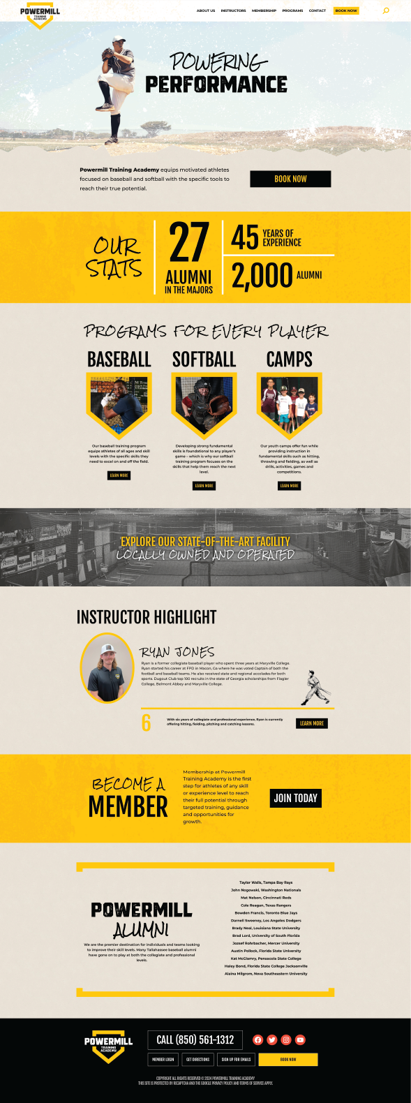
DIGITAL
A website that closes the sale before the call.
Parents researching training academies are making a trust decision before they ever pick up the phone. The Powermill web presence extends the brand identity into a digital environment that signals expertise and credibility from the first scroll.
DESIGN THINKING
The decisions behind the mark.
Every element of the Powermill identity was chosen to solve a specific problem — not to fill space or follow a trend.
Restraint as authority
Sports brands routinely overwork their visuals. We went the other direction — clean geometry, limited palette, no decoration that doesn’t earn its place. Restraint reads as confidence.
Dual-audience legibility
The mark had to excite a 15-year-old pitcher who wants to feel like a pro, and reassure his parents that this is a serious, credible program. Same mark. Both jobs.
Application-first design
The logo was tested against every planned touchpoint — apparel, web, signage, hat embroidery — before it was finalized. If it doesn’t work on a mesh hat, it doesn’t work.
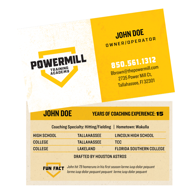
Business Cards
The business cards harken back to the golden age of baseball card design.
THE EXPLORATION
Eight roads to one right answer.
The final mark doesn’t arrive first. It arrives after a rigorous exploration — different directions, different structures, different ways of carrying the name and the category. Every concept shown here was a legitimate contender before the system pointed clearly to one direction.
"The businesses that grow fastest aren't always the ones with the best product — they're the ones that look like they belong in the room."
Perry Albrigo — President, Pomegranate Studio
THE DELIVERY
The Complete Package
Not a logo file and a handshake. A complete brand system the team can use on day one and hand off to any vendor without losing consistency.
01
BRAND IDENTITY
Primary mark, alternate lockups, icon-only version, and reverse/mono variants for every application.
02
BRAND GUIDELINES
Color palette, typography system, spacing rules, and do/don’t usage examples the whole team can follow.
03
APPAREL APPLICATIONS
Print-ready files for performance shirts, trucker hats, and future merchandise — sized and spec’d for the print house.
04
WEBSITE DESIGN
A digital presence built on the brand system — the same visual language online as on the field.
05
LOGO CONCEPTS
Eight distinct concept directions explored before arriving at the final system — the process is part of the product.
06
FINAL FILE PACKAGE
Every deliverable in every format — SVG, PNG, PDF, EPS — organized and ready for any future application.