Client: Florida Parent Educators Association (FPEA) Project: Quarterly lifestyle magazine design & production Scope: 44-page publication, recurring seasonal issues Issues shown: Winter 2026 & Spring 2026
THE BRIEF
A publication that earns a place
on the family bookshelf
The Florida Parent Educators Association needed a quarterly magazine that felt like a genuine lifestyle publication — not a member newsletter in disguise. Living Free had to look credible on a newsstand, hold the attention of busy homeschool families, and reflect FPEA’s values of faith, family, and intentional living.
The Challenge
Association publications often get stuck between two bad options: the generic newsletter template that no one reads, or the expensive custom print run that blows the budget. FPEA wanted something different — a magazine their members would actually look forward to receiving, with the editorial quality of a national lifestyle title, built for efficient seasonal production.
Needed a complete, repeatable design system
Had to integrate advertiser pages seamlessly
Content mix: features, departments, recipes, book reviews
Must feel fresh across seasonal issues without a full redesign
The Solution
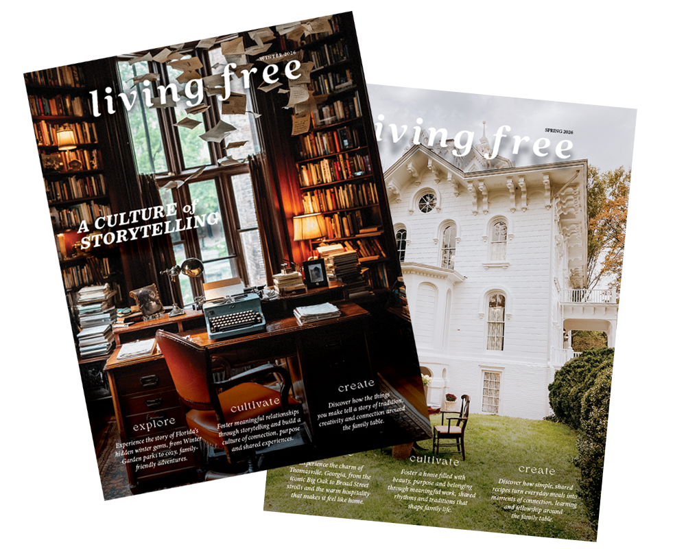
Pomegranate Studio developed a full editorial design system — masthead, typography, grid, and department templates — built to produce efficiently issue after issue. Each cover uses a signature editorial approach: single full-bleed photograph, minimal wordmark treatment, three content teasers. Interior pages follow a consistent but flexible grid that accommodates long-form features, short departments, advertising, and recipe layouts without visual chaos.
Complete brand and editorial identity system
Seasonal cover art direction strategy
Recurring department page templates
Print-ready production to press specs, every issue
44pp
Pages per issue print-ready
4x
Issues per year quarterly production
Branded
EACH ISSUE PRODUCED USING COMPANY BRANDING FOR CONSISTENCY
INSIDE THE ISSUES
Every page designed to
earn the reader's time
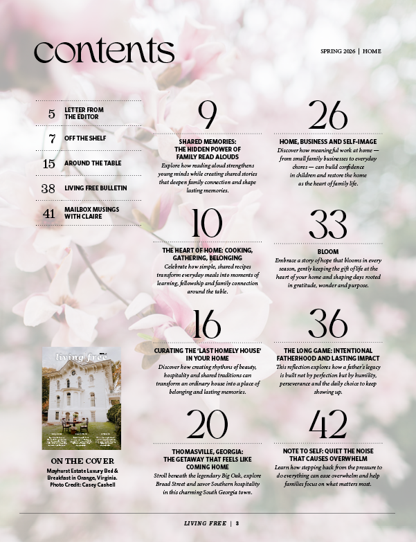
contents Clean typographic hierarchy with warm editorial photography.
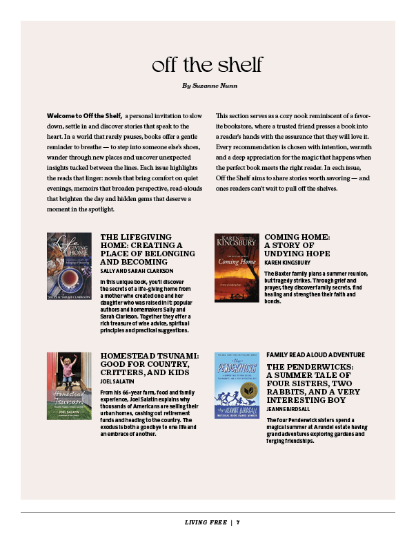
off the shelf Recommended reading from the association.
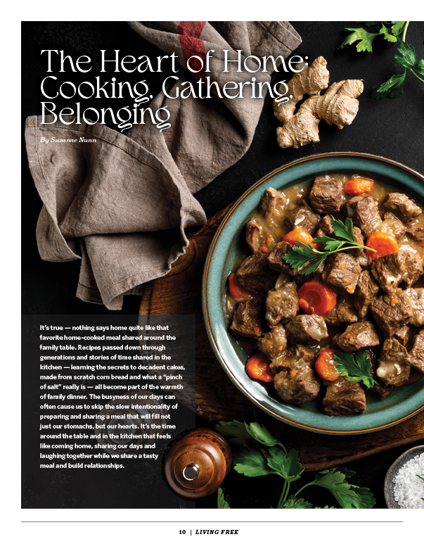
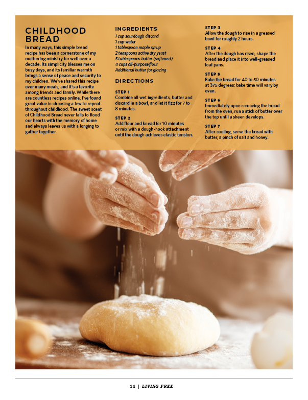
featured article “The Art of Home: Cooking, Creating, Remembering.” Script headline + editorial food photography.
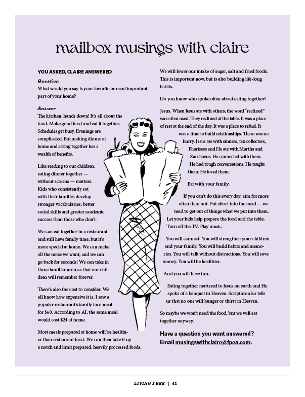
advice column Get your questions answered.
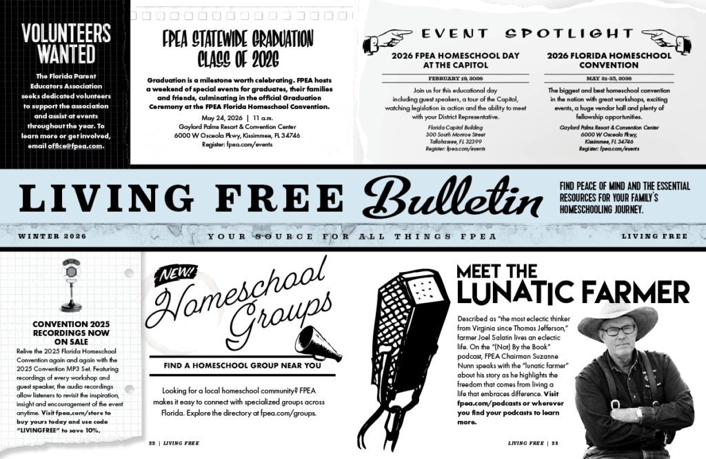
bulletin A one source spread for all things FPEA: events, volunteer requests, FPEA store promotions, etc.
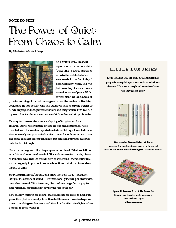
note to self column Advice for keeping sane while homeschooling!
featured article “The Art of Home: Cooking, Creating, Remembering.” Script headline + editorial food photography.
off the shelf Recommended reading from the association.
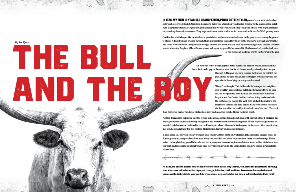
featured article The story of life lessons learned on the farm.
"The businesses that grow fastest aren't always the ones with the best product — they're the ones that look like they belong in the room."
Perry Albrigo — President, Pomegranate Studio
WHAT WE DELIVER
A complete publishing system,
not just a layout
Most design studios hand off a pretty PDF and call it done. We built FPEA an entire editorial production system — the kind that lets each new issue come together efficiently without reinventing the wheel every quarter.
Editorial Identity System
Masthead design, typography hierarchy (display, deck, body, caption), color palette with seasonal flexibility, and recurring page furniture elements used across every issue.
Cover Art Direction
A repeatable cover formula: full-bleed editorial photograph, wordmark placement, three content teasers, and seasonal color shift. Consistent brand recognition, fresh feel every issue.
Department Templates
Off the Shelf (book reviews), Letter from the Editor, Living Free Bulletin, Around the Table, and advertising pages — each with a distinct but harmonious template.
Feature Article Layouts
Flexible feature grid that handles long-form articles, full-bleed photo openers, pull quotes, drop caps, and multiple column configurations without visual chaos.
Print-Ready Production
Every issue delivered press-ready: correct trim size (8.375 × 10.875″), bleed, CMYK color mode, embedded fonts, and printer specs — no back-and-forth with the print house.
DESIGN THINKNG
The decisions that make it
look this good
Seasonal Palette Strategy
Rather than a fixed color system, each issue shifts its accent palette with the season — warm amber and library browns for Winter, soft rose and cool greens for Spring. The masthead and core identity stay constant; the mood adapts. Members notice it feels fresh without being able to say exactly why.
Cover Photography Philosophy
Every cover is built around a single, strong image that evokes the issue’s editorial theme rather than illustrating it literally. Winter’s dramatic library with flying books signals “storytelling culture.” Spring’s antebellum porch signals “home and belonging.” The connection is emotional, not obvious.
Typography as Editorial Voice
The type system pairs a classic serif for body copy with expressive display and script faces for headlines — giving features a warm, literary personality while keeping the reading experience clean and legible. A publication this family-oriented needed type that felt personal, not corporate.
Advertising Integration
Ads that clash with editorial content break the reading experience. We designed the advertising pages and surrounding editorial so transitions feel natural — same color range, clean layouts, consistent page furniture. Readers stay engaged. Advertisers get better results.
Your publication could look like this.
Whether you publish quarterly, monthly, or annually — associations, nonprofits, and membership organizations trust Pomegranate Studio to make their publication something members actually read.